Streamline the commission payment process by addressing data inconsistencies, improving navigation, and reducing user frustration across legacy systems.
Role and Scope
Client: Large life insurance organization Role: UX Designer Timeframe: 9 months Team: UX (1), Business Analyst (2), Developers (4), Product Owner (1), Data Engineers (2), Scrum Master (1)
Challenges
Navigating industry- specific jargon, complex calculations, and intricate workflows.
Translating the complex relationships between contracts and transactions into an intuitive navigation system.
Making user pain points relatable for the scrum team and bridging the communication gap.
Gaining expertise in 12 disparate platforms to address system-wide inefficiencies.
Research
Methodology: Conducted user interviews with employees across roles.
Understand daily tasks, pain points, and areas for improvement.
Learn business terminology and industry nuances.
Key Findings:
Escalation Overload: One director reported receiving over 200 emails daily, with 30% asking about delayed commission checks.
Time Drain: Account reconciliation employees spent half their day verifying missing or inconsistent data, acting as “detectives.”
"I (LCC Director) receive over 200 emails daily. 30% – When will I see a commissions check? 60% – Other escalations."
"I (Account Recon) spend half a day doing detective work (verifying missing or inconsistent data)."
Proposed Solution
Core Features
Global Search: Unified search across systems for faster data retrieval.
Date Picker: Streamlined task management and data filtering by date.
Tables & Drop-Down Menus: Simplified data organization and navigation.
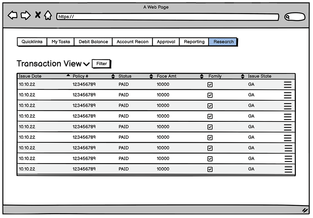
Primary Navigation
Grouped user tasks into dashboards, each tailored to specific roles and workflows.
Wireframes were used to organize functions and prioritize necessary data.
Design System Strategy
Established a cohesive design system to ensure consistency and scalability across interfaces.
Outcomes
Dashboards reduced task completion times by an estimated 40%, enabling users to focus on higher-value work.
Cross-functional workshops fostered empathy for user pain points, leading to more user-centered development practices.
Enhanced data verification tools cut down on escalations related to inconsistent data by 30%.
The design system allowed for seamless integration with legacy platforms and future scalability.
Conclusion
This project showcased the importance of deep user research in tackling complex workflows and improving user satisfaction.
By introducing dashboards, global search capabilities, and a cohesive design system, we significantly reduced user frustration and improved efficiency. While the solutions addressed critical pain points, the vast complexity of the legacy systems meant full implementation required ongoing iterations post-launch.
Despite these challenges, the project laid a strong foundation for future enhancements and demonstrated the value of user-centered design in resolving systemic inefficiencies.